Minggu, 28 Oktober 2012

Creating calming environments

When I'm planning a redesign, I want to know how clients want their space to feel. Many people don't think about that aspect of space planning while others are quick to elaborate on the topic. Words like peaceful, restful, and tranquil are showing up more and more in decorating conversations. People want to escape from the frantic pace of life to a calm environment.

Remove "clutter" and visually open the space


There isn't one "look" for a calm decor but there are guidelines/principles that can help you achieve a quieter environment in your own home.  

Minimalism and Zen come to mind immediately when you use the words serene and calm because  both aesthetics translate into living with less of everything- colour, objects, furniture, etc. It's about selected focus and getting rid of what is meaningless. Ask yourself what is absolutely essential and remove the rest.  It's liberating!  Rather than a gallery wall of art use one well chosen piece as the hallmark of the space. Rather than 8 pieces of furniture perhaps 4 will suffice. Put thought into what you want to display.


A clutter free home is usually achieved by having a place for everything and that means adequate behind the scenes storage. Of course filling up drawers and cabinets with junk defeats the purpose!  Purge to the core.


Limit palettes 


If you want a calm look you have to think about  colours that are soothing.  It won't be red or orange! White is at the top of the list, but if that is too stark, go for other  restrained colours like soft grays, ivories, soft beiges and neutrals that hint at lavender, green or blue. Consider painting walls and trim the same colour Then add accents that are softer colours like this beautiful green.

Accent judiciously 


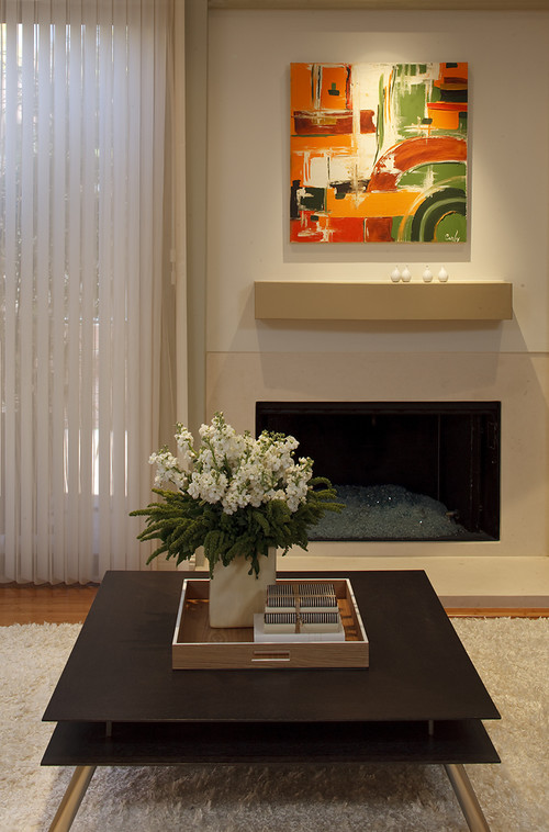
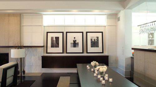
Choose bursts of colour in smaller accessories like pillows or vases. Hang  one colourful artwork or stack objects on a tray.  Again less is more. Note how the light textured rug helps to soften the harder lines of the furniture.


Simplify window treatments or have bare windows


Keep it simple, consider textured glass inserts or translucent film  rather than draperies.  If you like the softness of fabrics go for very clean lines and soft colours. Natural fibers translate well in more minimalist decors.   Roller shades and matchstick blinds also work well for a clean feel.


Control pattern and layer texture


You can use pattern effectively in minimal spaces, but control the scale and loudness of it. Small scale and tone on tone work best.  Ramp up your use of texture to create visual interest, think quilted, knobby, woven, rough, smooth etc.

Open up the space 


Spaces are restful when your eye can find a place to rest . The more open spaces the more restful.  Think about unrestricted sight lines in a space. Don't block walkways or windows with furniture , leave enough space to provide ease of movement. Of course light coloured furniture helps your eye move over it. Your room doesn't have to be stark. Warm it up with light textured rugs or throws.

Choose furniture with clean lines 

Forget about ornamentation and frills. Don't go for overstuffed and large scale, but do go for comfort.   No decor should be uncomfortable to live in.
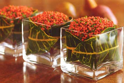

Use repetition

Repetition is a wonderful soother. Consider repeating the same shape or colour  to move the eye along.  

The repetition of colour and the shape in the  white chairs moves your eye along and helps with the competition of the black chair and vessel.  Natural elements are always attractive and calming especially when paired with vertical objects. I love the way the chair and flower act like an exclamation point.


Here your eye is drawn along the tea lights and flowers to the sparsely displayed art work. The repetition in the light fixture over the peninsula and in the mill work all helps the eye to wander calmly. 

Nature and repetition together creates a stunning shower.


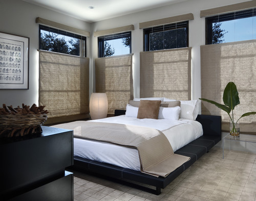
Select  uniform wood finishes

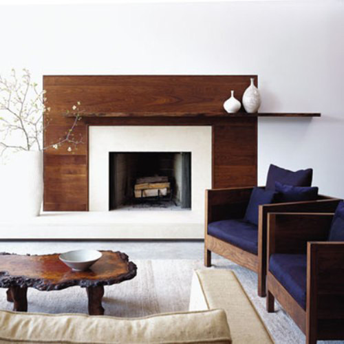
 The use of similar wood tones pull this room together visually.  You eye moves easily from piece to piece and the lighter colour palette is soothing and doesn't take away from the wood. 

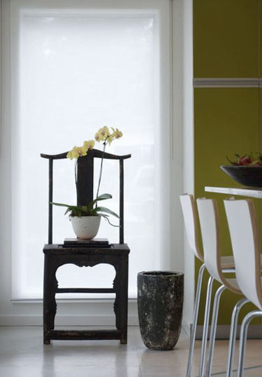
Use natural elements


 Plants, twigs, stones, pebbles, water, reference the calmness of  nature cycles. Use them well.

Include circular shapes
Nothing is more calming than spheres or circles. Think of several places you can add them to your decor.  A round table encourages the eye to mover around a space, round mirrors are calming  when well placed.  People often forget that mirrors can reflect aspects of decor that are not complementary to ones focus.Open vessels/bowls are soft and flowing.  Look back through the images to see how they have been used in various decors.

Selasa, 16 Oktober 2012

One simple move

 In my last post I presented my problem dining  room. I feel I've put the space on the road to salvation.  Here's the update so far.  I have more ideas, but they require a lot of elbow grease and won't happen before Christmas.  I think it's looking more spacious and welcoming.

Before

 After


 I moved  the furniture, placing the  buffets along the kitchen wall. and set the table up vertically in the space.   That allowed me to hang floor length draperies; these are temporary until  my custom ones are ready. My new ones will be off white and hung higher.  Yes, I do know these are too short! 

 The strong vertical of the draperies plays nicely against the railing and breaks up the horizontal lines.  I have a new light fixture which is larger in scale and hung a little lower, but not so low that  my tall family will bang into it! I still want to see the art work over the buffets while seated in the living room. I always choose function over anything else.

I also like the fact you can't look directly into the buffets from the front porch!  I'm  thinking about stripping the natural finish on the furniture and doing a gray wash to change the colour and make it stand out from the floor.  I'd love new chairs, lamps for the buffet,  something more interesting in the corner by the railing.....  We'll see......

What do you think?


Minggu, 14 Oktober 2012

Do you have a problem room?

We all have them, those rooms that defy all you know about design, and just continue to go about their merry way creating problems no matter what you do with them. I managed to create a monster a quarter of a century ago right  in the middle of my house because  my mind was focused on other things at the time. I've spent the intervening  years trying to make my dining room "right" by my standards - I haven't achieved that yet. 

No one has ever walked into my house and said "OMG, what a mess this dining room is."  So what's wrong with it  in my eyes?

Location:  When you're standing in my entry  you look directly into the dining room.  The archway frames the table and the window.  It is also a walk through space from the living room  on the right  to the kitchen which is to the left.

 
There is an alternate hallway beside the stairs, but we never go that way. My dining room is the room in the middle with no identity. Because the walkway needs to be maintained  only half the room is really accessible for  the table - problem #1.

I noticed another problem when I looked at this photo but it was easily fixed. Can you spot the fix?

Across from the table looking  toward the front porch. 
Top art work by Angela Antle and bottom by Anita Singh

A second artwork was added to connect with the chair below it. Doesn't that look better?

Furniture: The dining room buffets, table, and chairs were handcrafted, especially for me, by my man who can do anything.  The set has that "casual contemporary with a nod toward mid -century modern look" that I love.    The scale and style fits the room and the buffets are nicely tucked away behind the table.  Have you noticed problem #2 yet?

A rather dark  view  from the living room.  Thankfully the railings aren't that orange!

You're right! The furniture is the same height as the railing causing your eye to run along the lines and never go anywhere else. I've used all my tricks to make it otherwise, with minimal success. Note all the verticals - floor lamp, tall twigs, candle sticks, vertical artwork, accentuated vertical windows in living room.  The strength of the horizontal lines and the preponderance of wood wins out every time.

Flooring and railing
Problem #3
The aged oak is so orange- my least favourite tone in wood. Because I can't rip it all up or throw away the furniture, I've decided to embrace the orange  and pick it up in interesting art works that also have lots of purples and blues to tame down the orange.  

Problem #4 
Because the furniture is in one half of the room, there isn't enough space  for an area rug which would keep the furniture from blending into the floor.  If I wanted to use an area rug I would have to cover most of the floor, but that would mean vacuuming;  I would rather use a dust mop! 

Problem #5
I have a love/ hate relationship with the railing.  It is solid wood, has a good design and fits with the age of the house and our design aesthetic. I have strong feelings about maintaining "period "architectural detailing and the railing is necessary because the living room is sunken.  But it is soooo difficult to ignore that orangey railing..  It didn't look like this in 1986.  Time ages wood to either orange or yellow especially when treated with oil based products.  


Lighting 
Problem #6

The light fixture was an impulse buy  because I liked the lines,  but its scale is too small, and it is hung too high in my efforts to make sure you could see the painting at the end of the room.   As an artist, art always takes precedent over every other design  decision in my house.  This often leads me into hot water.

Wall colour 
Problem # 7

You may be thinking at this point why doesn't she have the walls pained a cooler neutral.  Can't happen because the living room, where most of the light comes from, is north facing and the house next door blocks off any light in the dining room.  Both rooms are dull and cold.  The living room is  Elephant Tusk OC 8 Benjamin Moore and the dining room is Light Khaki  BM 2148-40.

Window treatment
Problem #8 
I love these back tab drapes for the subtle design and their softness,  but the necessity to crop them to allow for the buffet further emphasizes all the horizontal lines. I also think I should have a window treatment that covers the window in some way so you can't see the wall of the next house with is very close to the window and certainly not interesting.

Matching set 
Problem # 9
I have an aversion to matched sets of furniture and here I am living with just that. Matching always looks so uninspired in my eyes and gives the appearance of laziness.  Like you couldn't be bothered to put the room together.  Yes I like a curated room and I have a bundled set!

I'm sure if I really tried I could find a Problem 10.  Many of you may feel it is the lack of cove mouldings, but that again is not part of the architectural details of the original house. 

 Well that about explains the problems. Who knew there was so much wrong with my dining room?  Most of my friends would be very surprised by this analysis!  In the next post I'll look at some possible solutions.  If you have anything to suggest that might help with my design dilemmas, I'd love to hear from you.


Rabu, 03 Oktober 2012

Simple ideas for your Thanksgiving table

Fall and Thanksgiving were heralded for the past month on various blogs and Pinterest. How much effort and expense are involved in your seasonal decorations?  My holiday tables always  give a gentle nod to  the season rather than a yell.  Usually I find things to combine from  my garden or my accessory  shelf in my storage room.  It is so much more fun to be thrifty and it stretches you to be creative with less.  In that vein, perhaps these ideas will get you thinking about how  to use what you already have.

 A few twigs from the garden and several small pumpkins in a large vase.  Simple and beautiful.  No pumpkins?  A trip to the Dollar store is in order for fake fall leaves (or the real thing) or spray paint assorted nuts gold and use those to anchor the twigs.

 Scoop  out a pumpkin just deep enough to place a candle in it and decorate the edges with faux leaves, twigs and berries.

 Collect all t he large clear vases you have, place a white pillar candle in each and decorate with nuts or leaves. Change to red berries for christmas. 

 Use the flowers of the season and bottles to rest one bloom in each .  Line them up along the table.

 Sunflowers, an old brass pan, berries and a green pumpkin.  While real sunflowers are beautiful you can substitute with fake ones. 
 Small vases with nuts, water and a flower on the top.  What else could you use to replace nuts?  A plaid tablecloth is always so cozy.

 Love this idea of stringing small pumpkins/gourds along the table with ribbon and a garland of berries.

 Use small potted plants, wrap them in a vivid croton leaf and place in square vases. Keep it until Christmas.


 I love kale but I've never thought of cutting it and using it inside as a bouquet.  Don't you love the purple ones?


I've been admiring these long wooden boxes for dining tables.  Each season what you put in them changes.  They would look just as inviting along a mantle.  Christmas idea for sure... any bits of wood in your basement?

Which is your favourite?

  All links to these photos can be found on my Pinterest  board.  

Related Posts Plugin for WordPress, Blogger...